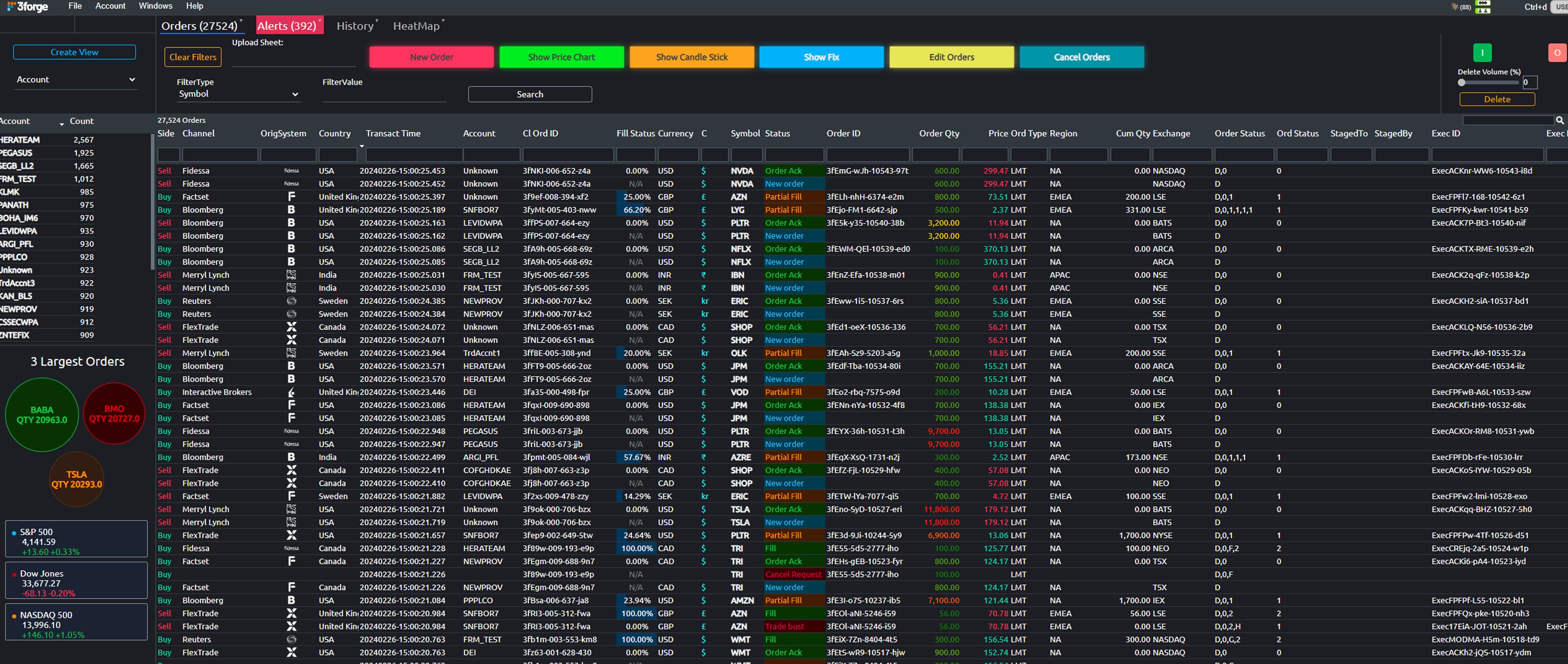
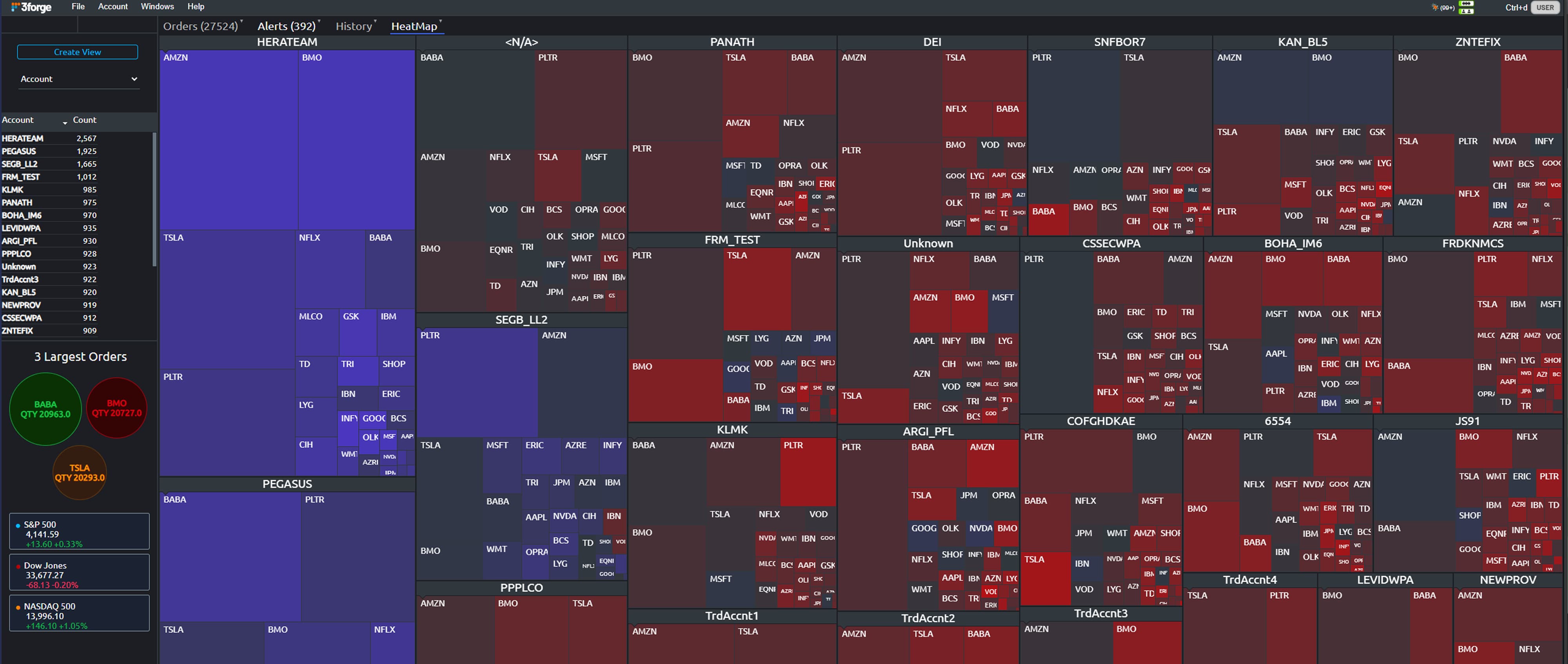
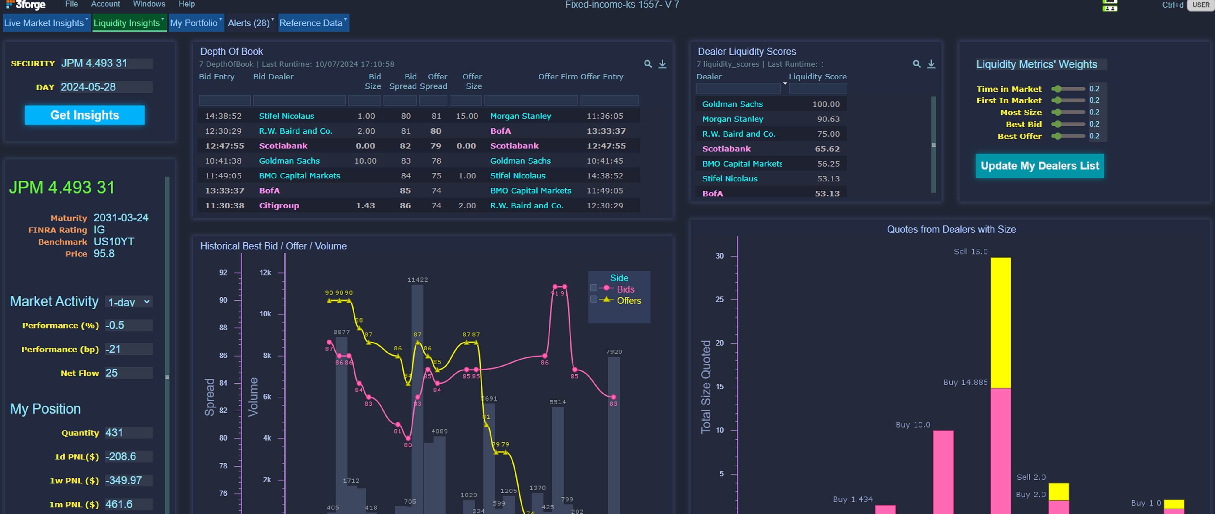
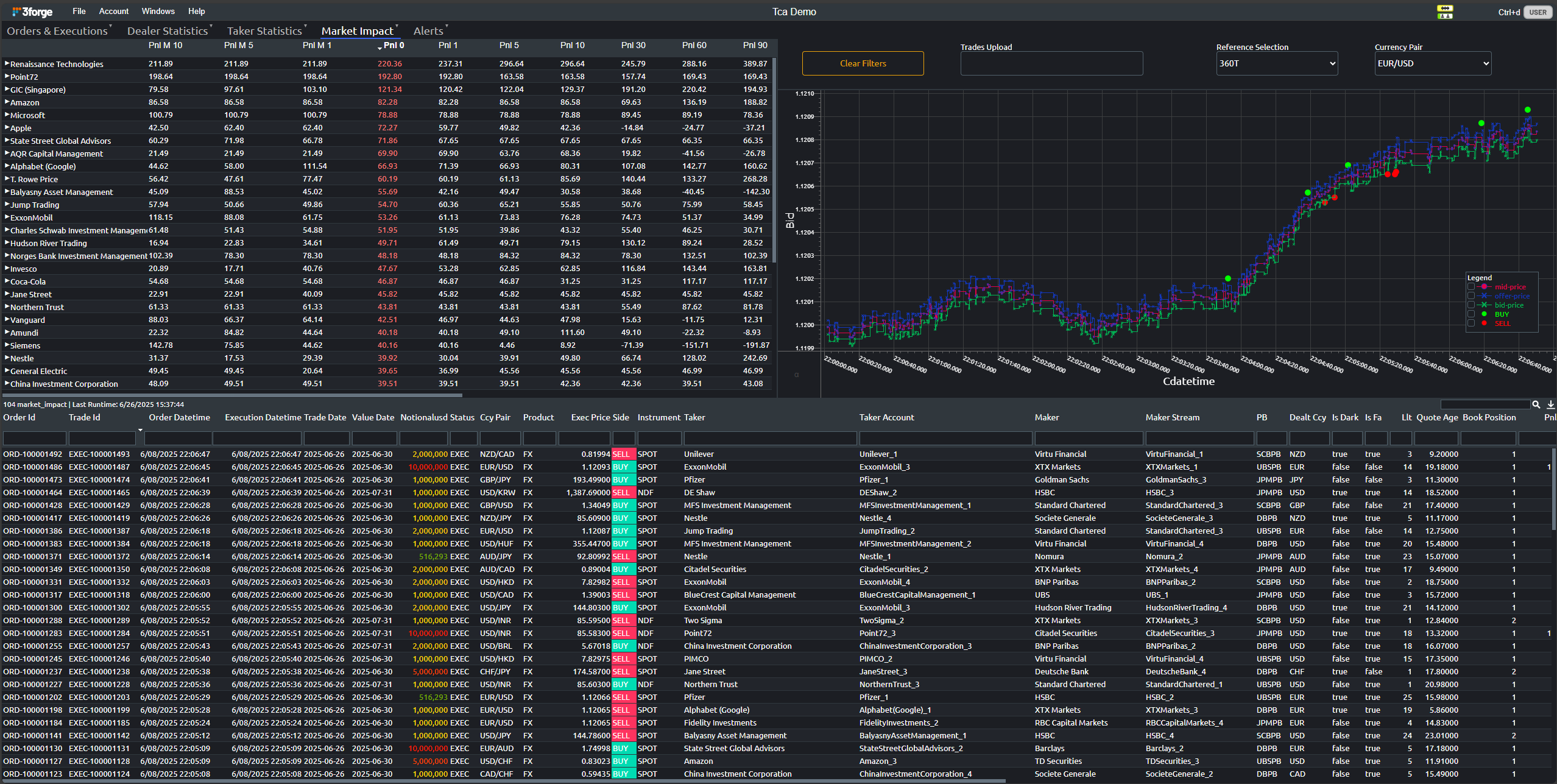
Case Study

Cost of Carry Visualizations

Case Study Graphic

About the company

The client's challenge was that they have an extensive Excel sheet executing a prime brokerage waterfall model to calculate cost of carry for their portfolio manager's position sets. Cumulatively, this was a couple hundred thousand rows and upwards of 40 columns, making the calculations hard to visualize meaningfully.

Case Study Graphic

Challenge

The client wanted a unified data visualization frontend that allows it to better leverage and analyze its complex cost data.

Solution

Within one week, we created and delivered a dynamic dashboard that takes the data and presents it in a number of different, customizable visualizations. The dashboard is permissioned so that when a PM logs into the web server, they only see the positions relevant to their portfolio, but a higher-level user can see all positions across the firm.

Case Study Graphic
Case Study Graphic

Benefits

We were able to significantly expedite the analysis of cost of carry calculations and build a dashboard with an intuitive UI to all stakeholders.

  • Aggregate data for the most important metrics are shown in the dashboard header and grouped further in a tree table by deal name
  • A dynamic heat map provides a more visual representation of each metric with portfolio, deal, and position-level granularity

3forge Solutions

The client was able to resolve their requirements with the following capabilities:

Download Full Case Study